To celebrate Black History Month and as part of the ESC’s ongoing DEI work, I’ve rounded up some of the best race-related data visualizations I’ve seen.
These powerful visualizations cover the timeline of slavery in America, current racial disparities, and diversity within federal leadership roles.
Take a look at what I chose. Is there anything I missed? Would you add any to my list? Send me an email to start a conversation!
- Slavery Wasn’t So Long Ago, visualized by Zerflin.
This simple timeline makes a big impact. It shows that in the United States, Black people have been considered property longer than they’ve been considered people. It’s shocking how recent slavery and segregation are when you look at the big picture of our country’s history.
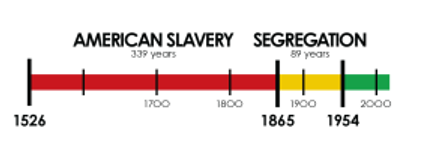 Source: https://zerflin.com/item/slavery-long-ago/
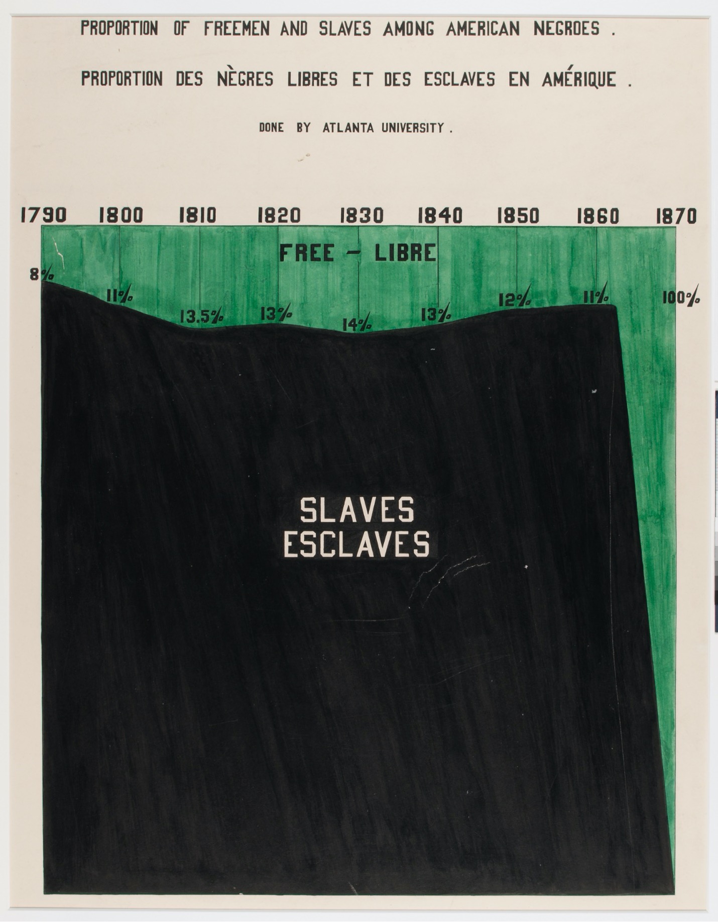
- Proportion of Free Versus Enslaved Blacks, visualized by W.E.B. Du Bois and his colleagues.
Du Bois and colleagues created some of the earliest recorded data visualizations in 1900 to portray the lives of Black people in America. You can read more about his groundbreaking visual report here.
 Source: https://medium.com/nightingale/w-e-b-du-bois-staggering-data-visualizations-are-as-powerful-today-as-they-were-in-1900-64752c472ae4
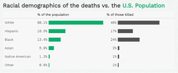
- Black People in America are Disproportionately More Likely to be Fatally Shot by Police Officers, visualized by Isabella Benabaye.
The charts include data from 2015 to 2020 and uses The Washington Post’s database of fatal shootings by police officers in the line of duty.
What I really like about the charts is the context provided by showing the parallel percent of the population next to the % of those killed. It helps to understand that while white citizens make up the largest percentage of those killed, Black citizens are killed at a disproportionately high rate compared to their percent of the population.
 Source: https://isabella-b.com/blog/us-fatal-shootings-police/
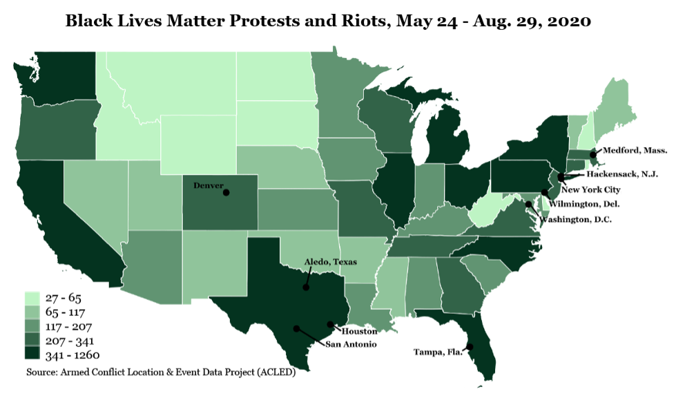
- Black Lives Matter Protests and Riots over a 3-Month Span in 2020, visualized by Ilena Peng.
What stands out is that there were protests or riots in all of the 48 contiguous states. I would have expected Minnesota to have among the highest number of protests, but the data show many other states had more protests. I would be curious to see if the patterns have changed when more recent months of data are included.
 Source: https://ilenapeng.wordpress.com/data-viz/
- Black Maternal Mortality Rate is 2.5 Times Higher than White Rate, visualized by Valentina D’Efilippo.
Although I find this chart a bit cluttered and I would prefer to see the categories sorted from highest to lowest, the differences between the races are startling. While the maternal mortality rate is getting worse for every race except for Asian/Pacific Islander, it is by far the highest for Black women.
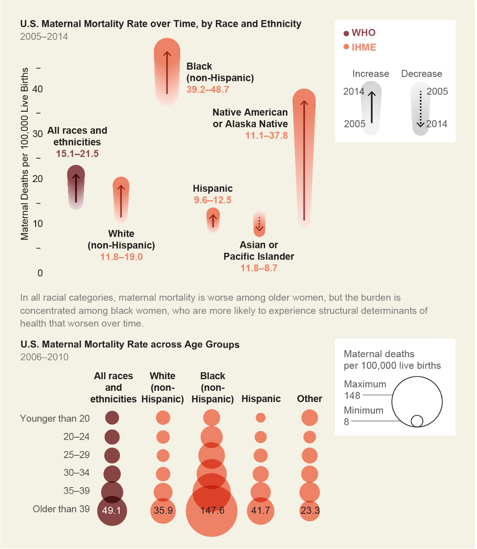 Source: https://www.scientificamerican.com/article/to-prevent-women-from-dying-in-childbirth-first-stop-blaming-them/
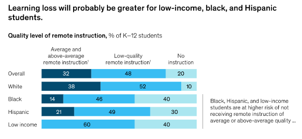
- 40% of Black Students Do Not Have Access to Instruction (as of June 2020), visualized by Emma Dorn, Bryan Hancock, Jimmy Sarakatsannis, and Ellen Viruleg at McKinsey & Company
Black, Hispanic, and low-income students are at an academic disadvantage with the country relying on remote schooling. The results of this inconsistency in instruction will likely persist for years.
 Source: https://www.mckinsey.com/industries/public-and-social-sector/our-insights/covid-19-and-student-learning-in-the-united-states-the-hurt-could-last-a-lifetime#
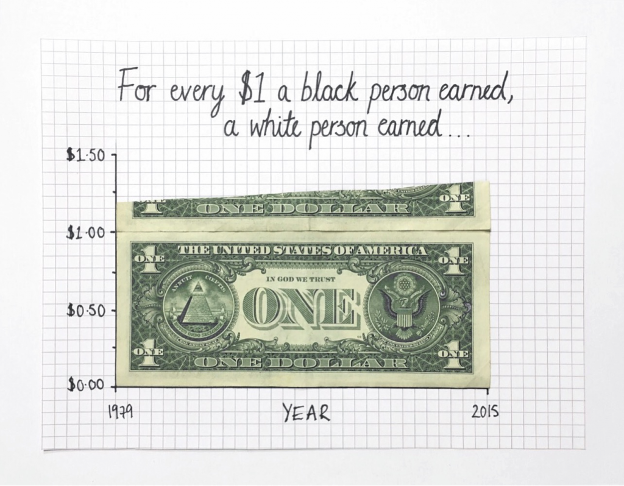
- The Black-White Pay Disparity Continues to Grow Wider, visualized by Mona Chalabi.
I love the use of actual dollar bills to portray financial data. It’s such a unique visualization strategy but invokes real recognition.
 Source: https://news.artnet.com/art-world/meet-mona-chalabi-1893221
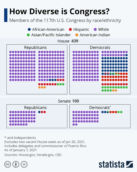
- Diversity of the Current US Congress, visualized by Katherina Buckholz at Statista.
I like this visual a lot but think it would benefit from including the context of the racial/ethnicity break-down of the American population. What jumps out at me is the relative lack of diversity within the Republican party compared to the Democratic party. Particularly within the Senate, there is still a long way to go to create a true reflection of the citizens they serve.
 Source: https://www.statista.com/chart/18905/us-congress-by-race-ethnicity/
- Notable Black Achievements, visualized by Eve Thomas.
Click on the image to go to an interactive visualization where you can explore who broke a race barrier and when. I really appreciate the color coding and category organization of this visual. It is packed with information without being visually overwhelming.
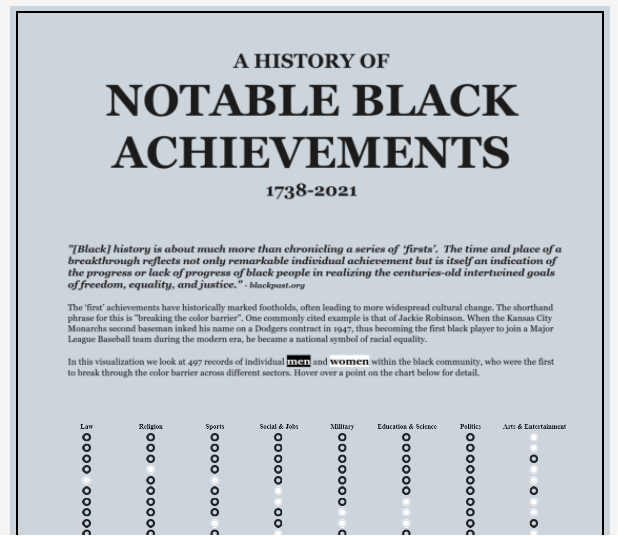 Source: https://public.tableau.com/en-us/gallery/history-notable-black-achievements?tab=viz-of-the-day&type=viz-of-the-day
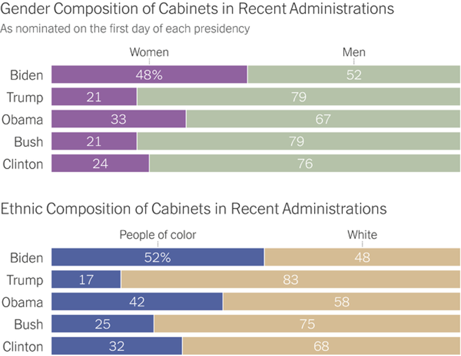
- The Current Cabinet is the Most Diverse in History, visualized by The New York Times.
As of January 21, 2021, President Biden’s cabinet appointees make his cabinet the most racially/ethnically diverse as well as the most equal for gender. The context of the past four presidents’ cabinets really add to the story the visualization is telling. You can see at a glance that even Obama didn’t push the bar as far as Biden has, though he likely laid the groundwork for the current administration’s diverse appointees.
 Source: https://www.nytimes.com/2021/01/21/us/biden-cabinet-diversity-gender-race.html
Data visualization is a powerful tool for making what would otherwise be boring data tables feel real. My favorite from the batch is the first one—the timeline of Black Americans. It is so simple and yet so powerful.
Which visualization speaks to you the most?
If you have seen other powerful visualizations, please share them with me!
Dr. Megan Johanson is a graduate of the Cognitive Psychology program at the University of Delaware. Megan’s research focuses on turning data into insights by collecting data intentionally, creating compelling visualizations, and facilitating conversations about how to use data to better serve the community.
Email Megan to see how she can help support your school or district.