 In honor of Women’s History Month and as part of the ESC’s work around Diversity, Equity, and Inclusion, I’ve curated a list of 10 great visualizations that reflect life for women. They cover topics from representation in media to job losses caused by COVID-19.
- Unpaid Work Across the Globe, visualized by Nayomi Chibana at Visme
I like this chart because it takes a less-intuitive visualization type (comparing the area of circles) and makes the data easy to understand at a glance by stacking the circles on top of each other. You can quickly see which countries have bigger disparities in unpaid work by noticing where the red circle is more visible- specifically, Japan, Korea, and India.
Unpaid work here includes “routine housework, shopping, care for household members, volunteering, and travel related to household activities.” Another thing that struck me was the sheer amount of time women are spending every day on these tasks: over 6 hours per day in Mexico and 4 hours per day in the US.
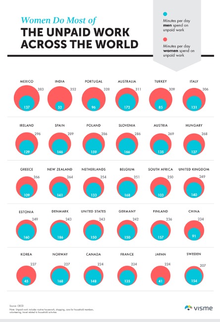 Source: https://visme.co/blog/unpaid-work-infographic/
- The Pink Tax, visualized by HowMuch.net, a financial literacy website
The pink tax is an issue I don’t think many people are aware of. The ribbon chart below depicts the average amounts men and women pay for everyday items. The differences may not seem like much, but keep in mind that almost none of these items are one-time purchases. For example, people must have multiples of each type of clothing item and throughout our lives we change sizes or jobs and need to update our wardrobes.
I’d also note that research has found women are considered more competent if they wear “professional” makeup, which is not cheap and not included in this visualization.
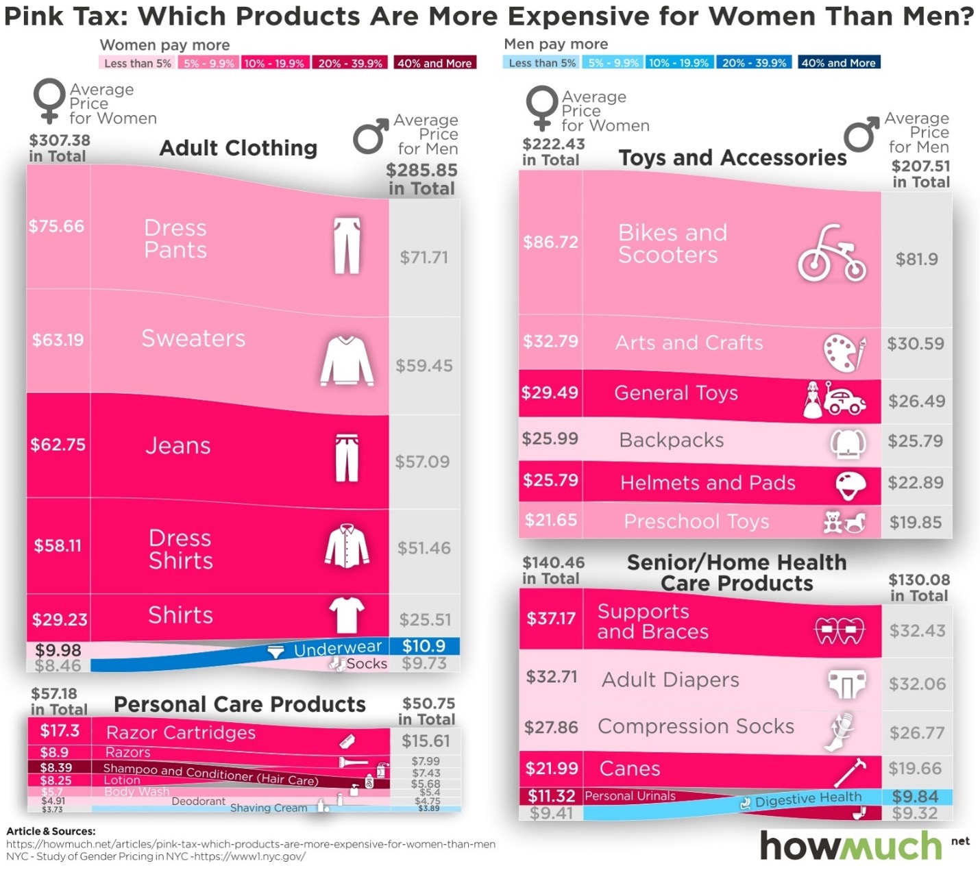 Source: https://howmuch.net/articles/pink-tax-which-products-are-more-expensive-for-women-than-men
- Richest Self-Made Women in America, visualized by HowMuch.net, a financial literacy website
I like the concept of this visualization and the fact that it is showing data that not many people will have seen before, but I find the smaller circles and labels hard to see. Interestingly, not many of the richest women in America are widely-recognized public figures. And while having a net worth of 4.9 billion might seem impossibly huge to us average-paid people, let’s bring in some perspective. Diane Hendricks, the richest self-made woman in America, is worth less financially than any of the 15 richest men in America.
Moreover, it’s hard for us to grasp the scale of billions and trillions of dollars. I recommend checking out this infographic depicting Jeff Bezos’ $176 billion estimated worth.
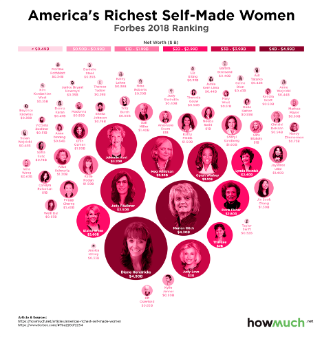 Source: https://howmuch.net/articles/americas-richest-self-made-women
- The Gender Pay Gap, visualized by the Wall Street Journal
This is a screenshot of an interactive visualization. Click on the image or the link below the image to go to the live chart.
In this chart you can see both the big picture of the pay gap, as well as explore the specifics of different professions. By looking at the chart as a whole, we can see that the largest pay gaps happen on the right side of the chart, where the salaries are the highest. This includes professions like economists, actuaries, lawyers, dentists, physicians, and surgeons. So, when we talk about female economists making 76% of what male economists do every year, that’s almost a $30,000 difference!
When you type in a profession or hover over a set of dots on the chart, you see the average salaries and the percent difference between men and women. It’s also really interesting to see the few professions where women make more than men, but the percent difference is much smaller compared to when men make more.
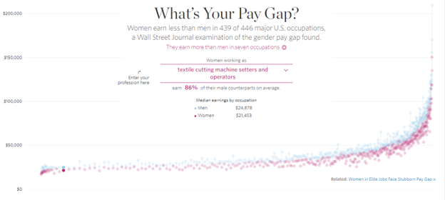 Source: http://graphics.wsj.com/gender-pay-gap/
- The Bechdel Test, visualized by Lyle Friedman, Matt Daniels, and Ilia Blinderman
The Bechdel Test is a way to assess whether movies do the bare minimum of showing women as real, complex human beings. A movie fully passes the Bechdel Test if it has two named women who talk to each other about anything other than a man. Seems simple, right? Oh, so wrong.
This visual is interactive, so you can click on the image or source link to view the live visual. Interestingly, this analysis brings in additional information by exploring the gender diversity of the movie writing team. The more women writers on the team, the more likely a movie is to pass the test. I’ve come across variations that also bring in data on race representation and behind the scenes gender diversity or allow you to filter by genre and gender of the director.
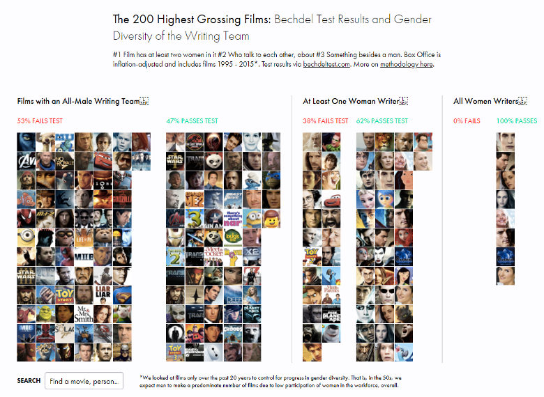 Source: https://pudding.cool/2017/03/bechdel/
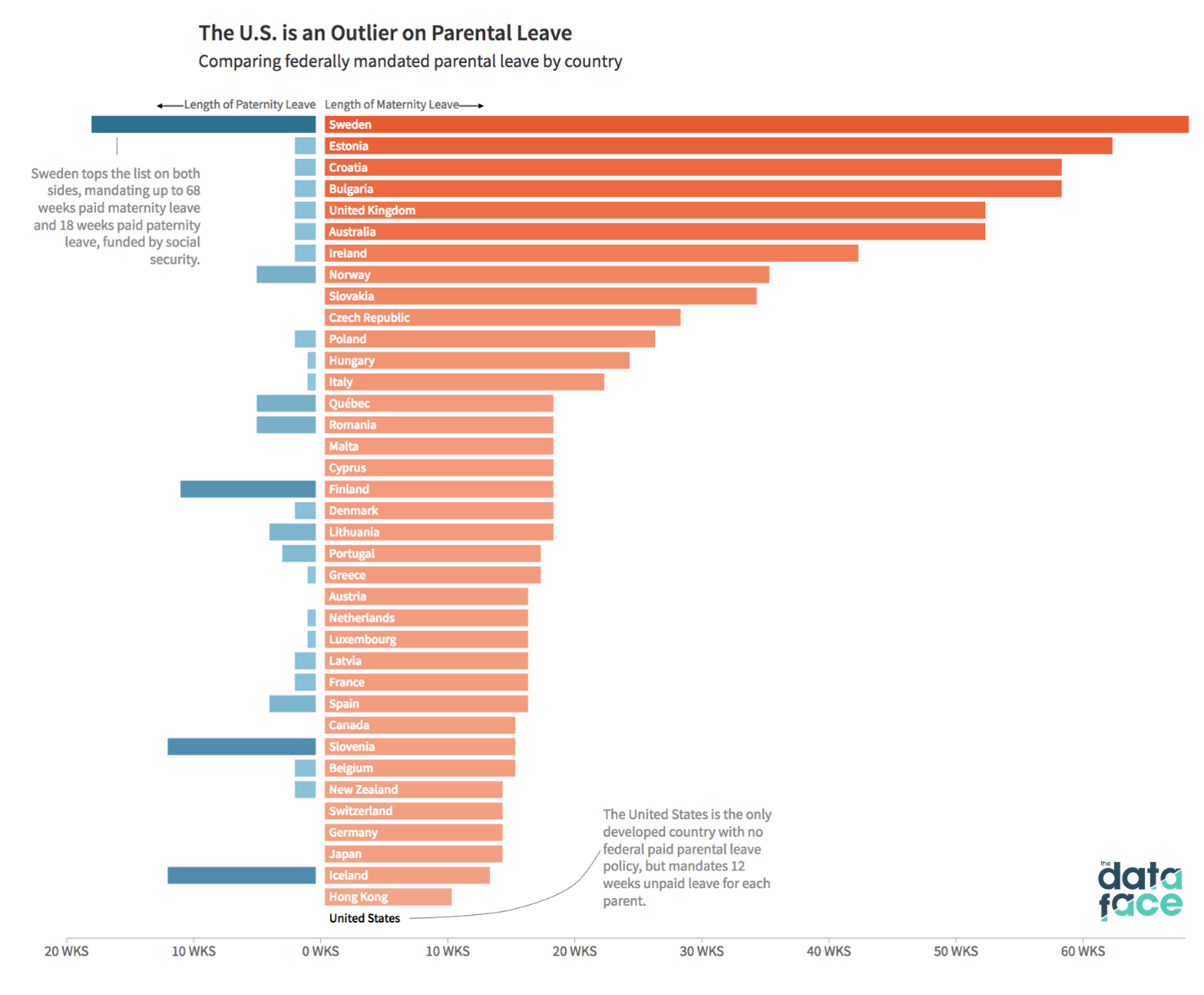
- Maternity Leave, visualized by The DataFace
This back-to-back bar chart shows the amount of paid parental leave granted in each country, although parents may not be paid 100% of their salary during their leave. The blue bars on the left represent paid leave for fathers and I was surprised and pleased to see so many countries that offer this.
The other thing that stands out due to an annotation at the bottom of the chart, is that the United States is the only developed country that provides no paid leave at all. This means that in families without savings, which was 45% percent of Americans before the pandemic, mothers have to return to work almost immediately after undergoing the intense physical trauma of giving birth or in the case of cesarean sections, a major surgery.
 Source: https://thedataface.com/2018/03/economy/parental-leave
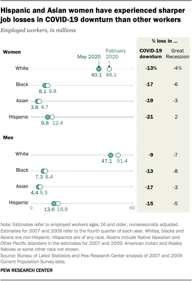
- COVID Job Losses, visualized by the Pew Research Center
This dot plot shows the change in employed workers between February and May of 2020 due to the pandemic. For every racial group, women lost a larger percentage of jobs than men did. However, the data also show that there are big job loss differences within women. Hispanic women saw a 21% loss in jobs whereas white women only had a 13% loss. Since this was only a few months into the pandemic, I’d be curious to see if the same patterns persist now- a year into the pandemic.
 Source: https://www.pewresearch.org/fact-tank/2020/06/09/hispanic-women-immigrants-young-adults-those-with-less-education-hit-hardest-by-covid-19-job-losses/
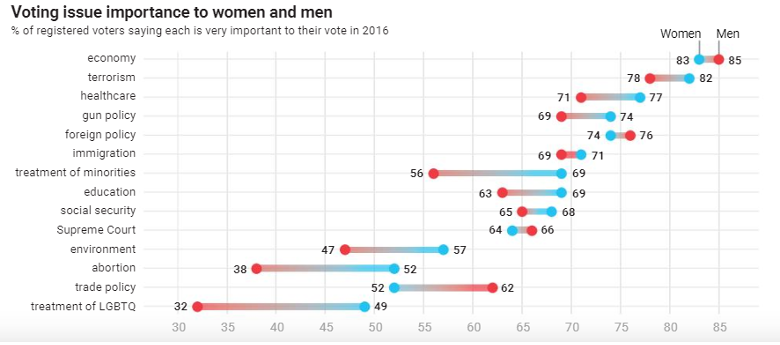
- Voting Priorities, visualized by Courtney Marchese for Fifth Wave
This dot plot shows the differences in men and women’s voting priorities. Compared to men, women prioritize issues related to social justice (treatment of minorities, LGBTQ people, immigration), the environment, and healthcare. Interestingly, treatment of LGBTQ people has the biggest gap between men and women, and ranks as the lowest priority (of those asked in the survey) for both genders.
This report contains a lot of incredible visualizations. If you are interested in women’s rights and experiences I highly recommend reading it.
 Source: https://issuu.com/creativsolution/docs/new_singles
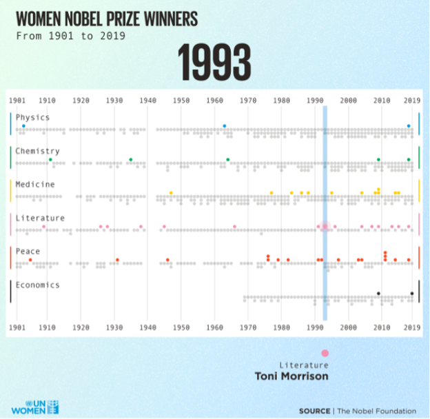
- Nobel Prize Winners, visualized by the Nobel Foundation
This is another interactive visualization. If you click on the screenshot below or the source link, you can view the live visual.
In this visualization, Nobel Prize winners are separated into categories and the gray dots represent all the men who have won. The colored dots represent women and the specific colors correspond to the category in which they won. From a big picture perspective, we can see that there have been a lot more women Nobel Prize winners in the areas of Medicine, Literature, and Peace compared to Physics, Chemistry, and Economics.
The visual, which is actually an animation, has a blue bar moving across the years. Whenever the bar passes over a colored dot, the category and name of the winner are displayed below the chart. It is a great way to learn about 120 years of leaders in 30 seconds.
 Source: https://www.unwomen.org/en/digital-library/multimedia/2020/2/infographic-visualizing-the-data-womens-representation
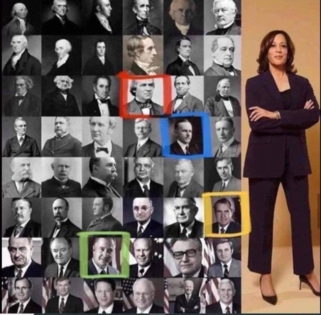
- Kamala Harris Makes History, visualized by ABC News and Melissa Shusterman
This is certainly not your traditional data visualization, but I wanted to include it because I found it very powerful.
The collection of images was originally created by ABC News, but I came across this image with the colored boxes included and this description by Melissa Shusterman: “Putting Kamala Harris as VP into perspective. See the red box? Until then, she would have been enslaved. See the blue box? Until then, she couldn’t vote. Yellow box? Until then, she had to attend a segregated school. The green one? Until then she couldn’t have her own bank account” Just adding a few colored boxes tells a clear and powerful story of how recently women and Black Americans were granted rights that were considered automatic for white men.
 Sources: https://abcnews.go.com/Politics/video/kamala-harris-make-history-vice-president-75353167 and https://twitter.com/melissaforpa/status/1353349448403976192
Which visualization do you think was the most powerful? For me, it is the parental leave chart.
Have you seen any other great visualizations that I missed?
Dr. Megan Johanson is a graduate of the Cognitive Psychology program at the University of Delaware. Megan’s research focuses on turning data into insights by collecting data intentionally, creating compelling visualizations, and facilitating conversations about how to use data to better serve the community.
Email Megan to see how she can help support your school or district.