It’s Pride Month and I’m back with 10 data visualizations that will give you a new view of the lives and experiences of LGBTQ+ people in the United States. There has been some progress for the rights and respect of LGBTQ+ people, but not nearly enough.
Throughout this article I will use the terminology from each visualization/report when describing it. Trigger warning: Visualization 4 on this blog post contains content about dating violence and rape.
1. LGBTQ+ Representation on TV, visualized by Madeline Stanislav
This visually beautiful sunburst chart packs in a lot of information, though it is not an exhaustive list of all tv shows. This visualization doesn’t tell the data story at a glance, but rather it makes you want to spend some time diving into it.
Some things that I notice are that of the shows and networks reviewed, Netflix has the most LGBTQ+ representation. It also appears to be 50/50 whether the actor playing an LGBTQ+ character is LGBTQ+.
While the color palette is beautiful, I find it a bit hard to map the colors in the legend to the ones in the chart. I’m also left wondering if there could have been a way to include coding for multiple LGBTQ+ characters in one show because the color-coding at that level only reflects one type of representation. For example, I know that Glee and Brooklyn Nine-Nine both have more than one LGBTQ+ character, but they are only coded as having a gay character.
[click here to enlarge visualization]
2. Police Harassment, visualized by Prison Policy Initiative
This simple but effective bar chart depicts the higher rates at which Black, Indigenous and People of Color (BIPOC) transgender people have police interactions or are harassed by the police, compared to white transgender individuals. Black and Multiracial transgender people are twice as likely to experience a police interaction or harassment than white transgender people.
3. Perceived Discrimination, visualized by FiveThirtyEight
This line chart depicts the percent of Americans that believe various underrepresented groups experience a lot of discrimination. The orange line nicely draws our attention to the main point of the chart: that perceived discrimination of gays and lesbians has gone down over the years.
However, whether LGBT people actually report a reduction in discrimination is a different question that this dataset can’t answer.
Trigger warning: This visualization contains content about dating violence and rape.
4. Dating Violence, visualized by the Center for Disease Control and Prevention
This infographic was clearly designed to give off a youthful vibe, but the content included is incredibly serious. The data were collected in 2017 from nearly 15,000 students.
LGB students were about 3x more likely to experience physical and sexual dating violence compared to heterosexual students. Students unsure of their sexuality were more than twice as likely to experience physical and sexual dating violence. Both of those groups of students were also much more likely to have been forced to have sexual intercourse (LGB students-4.5x as likely, students unsure about their sexuality-almost 3x as likely). That’s nearly 1 in 4 LGB youth, an alarming statistic.
Clearly, even questioning one’s sexuality is related to an increased risk of teen dating violence.
5. Unprotected by Laws, Visualized by Gabrielle Merite for Behance
This is another beautiful but complex visualization. It’s a small multiples chart with parallel visuals for each of the 50 states. What stands out most are the colors. Colors represent that LGBT people are protected by law in certain ways. The different colors reflect the different legal areas: employment, education, housing, public accommodation, credit.
The small United States map in the top right corner gives a high-level view of the geography of LGBT protection laws. The Northeast is most likely to have full protection and the West Coast states have at least partial protection.
A scan of the visual shows us that about half of the states have zero laws protecting LGBT people against discrimination. Only 11 states have legal protection across all 5 areas. For states with no protective laws, sexual orientation or gender identity are legal reasons for firing someone or not allowing them to rent a home.
 [Click here to enlarge visualization
]
6. Demographics and Geography of the LGBT Population, visualized by the Williams Institute, UCLA School of Law
This choropleth or ‘heat’ map is just one component of an interactive visualization on the demographic characteristics of LGBT people in the United States. Click on the image or source link to access the original visual.
From the map we can tell that states with the highest proportion of LGBT people are on the West Coast and in the Northeast, which aligns very closely with the map in the previous visualization showing states that legally protect LGBT people from discrimination[SR1] . What we can’t tell is whether LGBT people live there because of the protective laws, or the laws were passed because LGBT people live there. It’s an interesting question!
You can’t tell from this static image, but when you go to the full original visualization you learn that Washington D.C. has the highest proportion of LGBT people anywhere in the country. In fact, the proportion of LGBT people in D.C ( 9.8%) is almost twice as high as the next highest location, Oregon (5.6%).
7. Vulnerability for Unhoused Transgender People, visualized by Kaela Roeder for Street Sense Media
The article in which this chart is found states that “one in five transgender individuals have experienced homelessness at some point in their lives.” This diverging, or back-to-back, bar chart identifies the additional challenges that transgender indivduals who are homeless without a shelter face, relative to those who are homeless but have temporary shelter.
In almost every category, unsheltered, homeless transgender people are more vulnerable. The most prevalent challenges are around substance abuse, and mental and physical health. Being sheltered is associated with a huge reduction in vulnerability to most of the identified challenges.
8. LGBT Healthcare, visualized by Lambda Legal
This is another simple but compelling bar chart. The report it came from included many related questions demonstrating a similar pattern of healthcare professionals being noninclusive and unhelpful to individuals in need of care.
One in four transgender individuals reported being refuse health care. As a cis-heterosexual person I’ve never had that happen to me, so it is outrageous to think this is happening so frequently to my fellow humans. 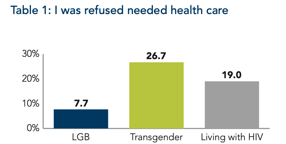
9. Support for Same-Sex Marriage Across Political Party, visualized by Gallop
This line chart is color-coded by political party and shows a general pattern of increasing support for same-sex marriage between 1996 and 2020.
As the graph shows, democrats have always been more supportive and the gap between the political groups started off small, at 17%. The gap between democrat and republican support reached its largest in 2013 (45%) but has been narrowing in recent years. As of 2020, half of Republicans support same-sex marriage.
10. Same-Sex Marriage Laws: Interactive visual, visualized by /u/FeCr204
This visual is animated and it depicts each state’s laws surrounding same-sex marriage between 1995 and 2015, when same-sex marriage became legal across the country. Click on the image or source link below to go to the original gif.[SR1] The gif is a helpful way to view the path to progress. It isn’t straightforward and it spans years, but seeing all states turn blue and move up to the ‘Legal’ quadrant evokes a real sense of accomplishment.
Clearly, there is still a lot of work to be done to support the health and happiness of LGBTQ+ individuals in this country. Pride month is great for celebrating progress and individuality, but let’s not forget the very real challenges LGBTQ+ people face every day.
Dr. Megan Johanson is a graduate of the Cognitive Psychology program at the University of Delaware. Megan’s research focuses on turning data into insights by collecting data intentionally, creating compelling visualizations, and facilitating conversations about how to use data to better serve the community.
Email Megan for more information about data and the LGBTQ+ community